Bostin
Paulo Goode · Paulo Goode · 2024
displayRetro display
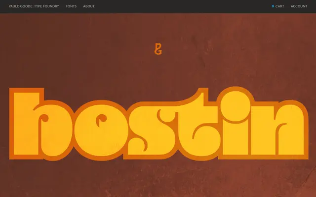
A single-weight display typeface inspired by Othmar Motter's 1972 Motter Ombra, designed for headlines, logotypes and branding with an overtly seventies character.
About
Bostin takes its cues from the decorative geometric sensibility of Motter Ombra while developing a distinct personality of its own. It is intended for large-scale use in signage, titles and branding, where its playful and flamboyant forms can be fully appreciated. The character set covers Latin European languages across 400+ glyphs.
Classification
A flamboyant display typeface with a single style, designed for large-scale use in headlines and branding. Inspired by Othmar Motter's 1972 Motter Ombra, placing it firmly in the decorative/retro display category.
Weights
Regular
Languages
Latin
Tags
displayretroseventiesdecorativeheadlinebrandinglatinmotter-ombra