Mojo
Parkinson Type Design · Jim Parkinson
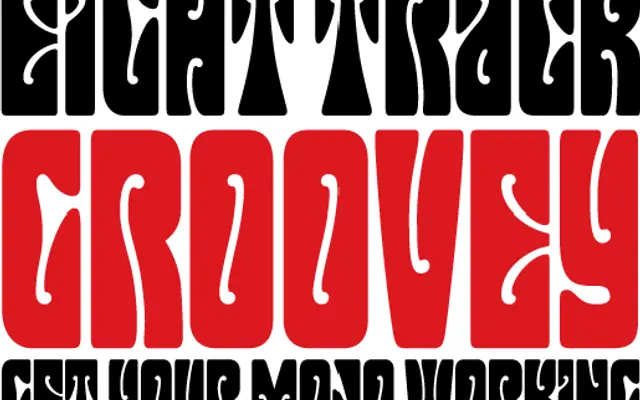
A display face adapting the swollen, organic lettering style of 1960s San Francisco psychedelic poster artists Wes Wilson and Rick Griffin, itself derived from Alfred Roller's Viennese Secessionist work.
About
Mojo captures the inflated, sinuous character of the hand-lettering that defined counter-culture concert posters of the 1960s Bay Area scene. The style's origins lie in Alfred Roller's early 20th-century Viennese poster work, which Wilson and Griffin reinterpreted with a distinctly psychedelic sensibility. The result is a typeface suited to period-referential design work requiring that unmistakable bubble-letterform quality.
Classification
A display typeface adapting the inflated, sinuous letterforms of 1960s San Francisco psychedelic poster art, tracing its roots to early 20th-century Viennese Secessionist poster design by Alfred Roller.