Chromatic Fonts
Parkinson Type Design · Jim Parkinson
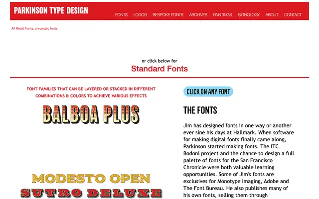
A collection of layered display fonts from Jim Parkinson designed to be stacked or combined in different colour configurations to produce chromatic effects.
About
Drawing on the tradition of chromatic wood type printing, these fonts are built for layering, with each component intended to align precisely when stacked. Different combinations produce varied colour and shadow effects suited to decorative headline and display use. Parkinson developed the collection through decades of lettering and type design work, including major projects for the San Francisco Chronicle and ITC.
Classification
These are layered or stackable display fonts designed to be combined in multiple colour configurations, a format historically associated with chromatic wood type printing.