 MegaMegaTypeType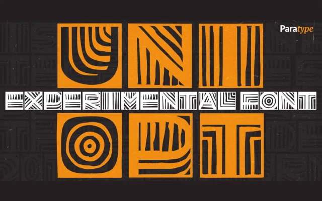
An Op Art display face by Viktor Kharyk built on a strict double-width grid, drawing on early 20th-century experimental lettering and covering Latin, Greek and Cyrillic.
About
The design takes cues from Peter Miturich's 'Graficheskaya Azbuka' and Victor Vasarely's geometric work, applying a free brush sensibility within a rigid square-cell structure. Diacritical marks are contained within the same square fields, preserving the grid's geometric regularity. Inverted character variants extend its decorative range, enabling complex vertical compositions and colour combinations. The font was recognised at the TypeArt'05 Contest in Moscow.
Classification
An experimental display face built on a rigid double-width grid with Op Art influences and free brush origins, placing it firmly in the decorative display category. Its geometric, inverted-character system and poster-oriented design distinguish it from conventional type families.