 MegaMegaTypeType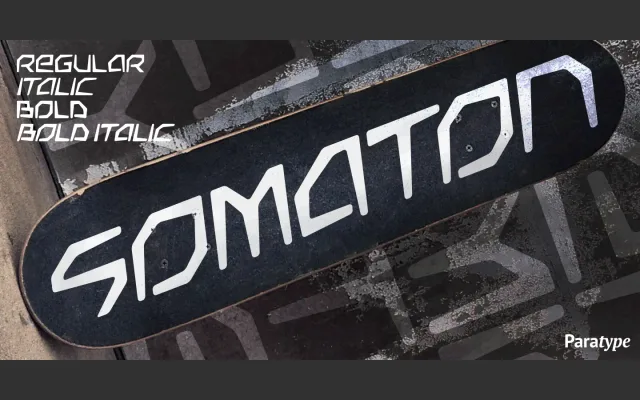
An all-caps display family from 2000 designed for advertising and teenage-market typography, offering dynamic oblique and stable upright styles across four cuts.
About
Designed by Vladlen Erium, Somaton is a caps-only face built around modern letterforms with a futuristic, high-energy character. The family pairs upright Book and Bold weights with matching obliques, lending it versatility across poster and screen applications. Its extended proportions and decorative quality suit it to advertising contexts where impact takes priority.
Classification
An all-caps display face with modern, dynamic letterforms designed explicitly for advertising and poster use. The slanted oblique styles and futuristic character place it firmly in the decorative display category.
Weights
BookBold
Languages
Latin
Tags
displaycaps-onlydecorativefuturisticadvertisingposterobliqueextended