 MegaMegaTypeType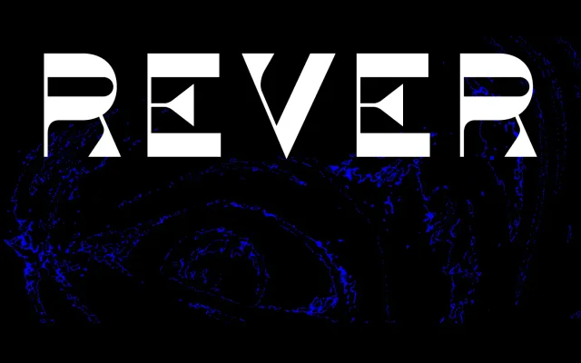
A three-style reverse-contrast display face that channels 19th-century wood type through stripped-back geometric forms, with an unconventional set including a leftward oblique and a stencil cut.
About
Rever approaches the reverse-contrast tradition – horizontal strokes heavier than verticals – with deliberately simple, geometric letterforms rather than historical ornament. Its three styles depart from convention: the oblique slants left rather than right, and the stencil variant extends the experimental premise further. Suited to typographic work in web, print and motion contexts.
Classification
A display typeface with reverse stress, where horizontal strokes are heavier than verticals, alluding to 19th-century wood type traditions while maintaining simplified geometric letterforms.