 MegaMegaTypeType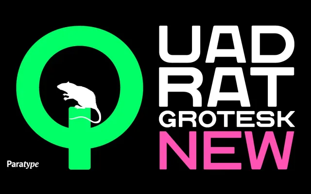
A 2004 reworking of Vladimir Pavlikov's earlier Quadrat Grotesk, cleaned up for screen and print use with rectangular proportions that favour compact, multi-line settings.
About
The new version discards the worn traces of the original, presenting clean letterforms built on rectangular proportions that hold up well at small sizes. Three weights -- Regular, Bold and Black -- cover the essentials for documents, web pages and layouts where line economy matters. Its extended character width and even stroke contrast give it a retro, poster-ready quality at larger sizes.
Classification
A grotesque sans-serif with rectangular proportions, designed for high legibility at small sizes. Its even, upright construction places it firmly in the grotesque tradition.
Weights
RegularBoldBlack
Languages
LatinCyrillic
Tags
grotesquerectangularvintageretroscreenposterextendeddisplay