 MegaMegaTypeType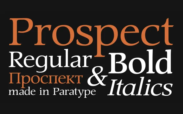
A wide-proportioned display serif by Natalia Vasilyeva, designed between 1997 and 2001, with slanted-edged serifs drawn from the designer's own hand lettering.
About
PT Prospect pairs wide letterforms with freely drawn shapes and serifs that carry slanted, calligraphic edges rather than the bracketed or slab conventions of text serifs. The design's roots in hand lettering give it a loose, individual quality suited to titling and display composition. Four styles cover the core typographic range: Regular, Italic, Bold and Bold Italic.
Classification
A display serif with wide proportions and slanted-edged serifs, rooted in the author's own hand lettering. The free letterform construction and titling focus place it firmly in the display serif category rather than text or transitional traditions.