 MegaMegaTypeType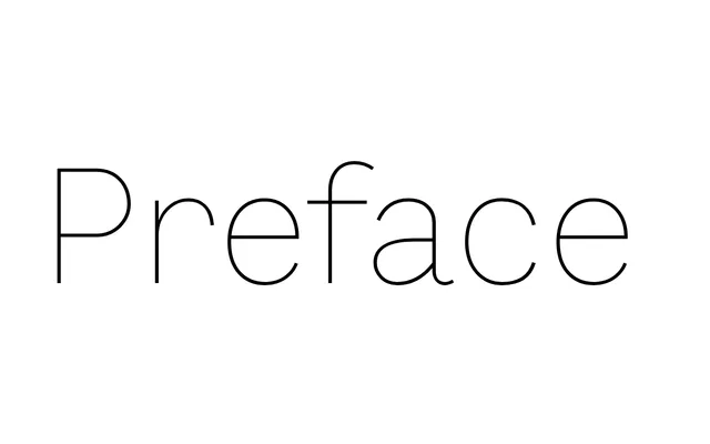
A 12-style grotesque from Shinntype that pushes past Helvetica's frozen conventions by borrowing the proportional logic of typewriters, road signs and early monitors.
About
Preface positions itself as a counter to the Helvetica-led monoculture, seeking to revive and advance the 19th-century grotesque genre. Nick Shinn draws on the metrically regularised letterforms of non-print media – typewriters, highway signage and cathode-ray displays – to produce a grotesque with a deliberately non-corporate character. The family spans six weights from Thin to Black, each with a matching italic, totalling 12 styles.
Classification
A grotesque sans-serif that deliberately advances the 19th-century grotesque tradition beyond Helvetica, incorporating influences from typewriter, road signage and early computer monitors with a pseudo-naive metricality.