 MegaMegaTypeType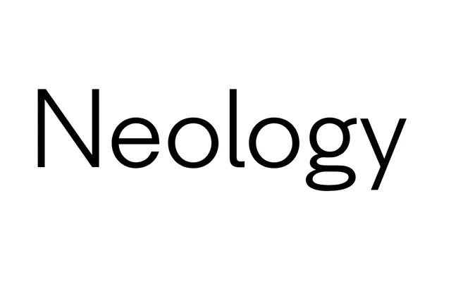
An experimental family from Shinntype that deliberately mixes 1920s geometric and Helvetica-style grotesque letterforms to test whether typographic consistency is a prerequisite for fluent reading.
About
Neology comprises three sub-families: a base family that blends both styles, Neology Deco drawing on minimalist 1920s geometric forms, and Neology Grotesque modelled on mid-century grotesques but with a small x-height. All fonts include three-quarter and full cap-height lining figures, while the plain styles offer stylistic alternates targeting the most character-specific letterforms in each sub-family.
Classification
A hybrid display family combining 1920s-style minimalist geometric (Deco) and Helvetica-like grotesque (Grotesque) letterforms within a single unified system, challenging the assumption that stylistic consistency is necessary for legible reading.