 MegaMegaTypeType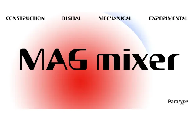
A single-weight decorative display face by Dmitry Kirsanov, derived from Magistral's forms but pushed into an industrial, high-contrast direction with strong horizontal geometric shifts.
About
Designed in 2005 as a conceptual offshoot of Magistral, MagMixer amplifies that typeface's underlying structure into something deliberately strange: each glyph pairs maximum stroke contrast with a horizontal displacement that gives the letters an almost architectural quality. The resulting rhythm is active and enigmatic, evoking building constructions and chess boards rather than conventional typographic forms. Intended for advertising and display use, it carries discretionary ligatures and alternates to sustain visual interest at large sizes.
Classification
A highly stylised display face with maximum stroke contrast and horizontal geometric shifts in each glyph, placing it firmly in the decorative display category. Its industrial, chessboard-like letterforms resist classification as a conventional serif or sans-serif.