 MegaMegaTypeType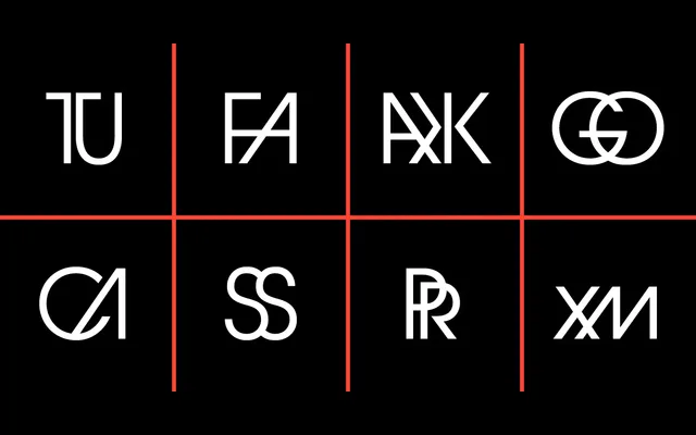
Herb Lubalin and Tom Carnase's geometric sans, originally drawn for the Avant Garde magazine masthead and released by ITC in 1970, offered here in ten styles across four weights with matching obliques.
About
ITC Avant Garde Gothic is built on near-perfect circular letterforms with uniform stroke width and exceptionally tight spacing, characteristics that made it one of the most distinctive geometric sans-serifs of the 1970s. The design originates from Lubalin's logotype work for Avant Garde magazine, later formalised into a retail typeface with Tom Carnase. This ParaType edition covers four weights from Extra Light to Demi Bold, each accompanied by an oblique.
Classification
A geometric sans-serif with near-perfect circular forms and tight, even spacing, derived from Herb Lubalin's logotype for Avant Garde magazine. Its uniform stroke width and modular geometry place it firmly in the geometric sans tradition.