 MegaMegaTypeType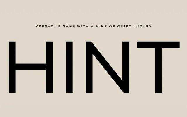
A geometric sans from ParaType offering eight weights with matching italics, variable font support, extended Cyrillic and Latin coverage, and a rich set of stylistic alternates that shift the typeface from neutral to expressively old-grotesque in character.
About
Hint's default setting reads as a clean, evenly rhythmic geometric grotesque suited to branding, interface and long-form text alike. Activating its stylistic sets unlocks single-storey 'a' forms, closed apertures reminiscent of 19th-century grotesques, and alternate 'g', 'K', 'M', 'R' and 'W' shapes that substantially alter its mood. Each of the 18 styles contains over 1,500 glyphs and more than 30 OpenType features, including small caps, multiple figure sets and a micro-typographer set that automates quotes, dashes and superscript corrections.
Classification
A geometric grotesque with a neutral default character and extensive stylistic sets that can evoke late 19th to early 20th-century grotesque forms. The design follows geometric sans conventions with optionally single-storey 'a', closed apertures and rounded alternates.