 MegaMegaTypeType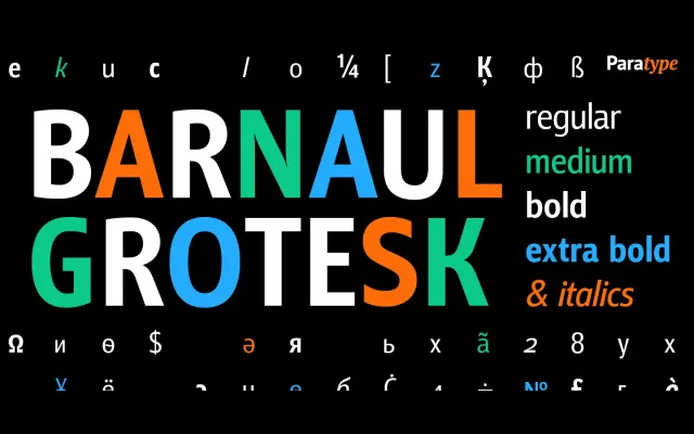
A narrow, open-aperture text sans from Natalia Vasilyeva, released by ParaType in 2007 across four weights with matching italics.
About
Barnaul Grotesk's narrow proportions and open shapes make it economical in text setting without sacrificing legibility on screen or in print. Four weights from Regular to ExtraBold, each with an italic, give it enough range for newspaper, handbook and display work. Old-style figures and alternates extend its typographic utility.
Classification
A text-oriented sans-serif with narrow proportions and open apertures, placing it in the grotesque tradition suited to continuous reading and display use alike.
Weights
RegularMediumBoldExtraBold
Languages
LatinCyrillic
Tags
grotesquetextnarrowopen-aperturesnewspaperscreendisplayworkhorse