 MegaMegaTypeType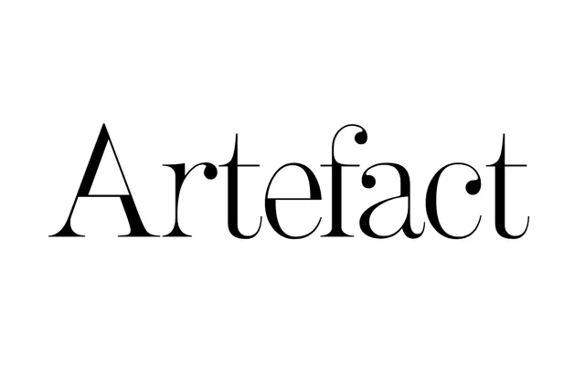
A postmodern reworking of the Didone style by Shinntype, deliberately inverting the thick-thin stress conventions of 19th-century Modern types to produce an unsettling, corroded typographic texture.
About
Nick Shinn deconstructs the Didone vocabulary by questioning which stems should be thick and which thin, subverting the calligraphic logic that underpins the style. The resulting forms carry what the foundry describes as a corroded notan, producing an unusual typographic colour suited to high-contrast poster and display work. Three weights are available: Light, Regular and Bold.
Classification
A postmodern deconstruction of the 19th-century Didone (Modern) style, reversing and subverting the conventional stress and thick-thin stem relationships inherited from calligraphic tradition. The result sits firmly in the display category through its extreme contrast and experimental character.