displaydisplay
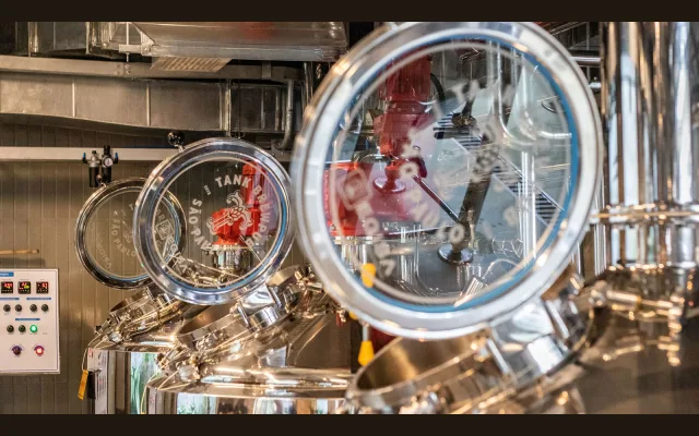
A visual identity project for a São Paulo brewpub, built around bold typographic compositions, a vibrant colour palette and over 100 unique illustrated labels.
About
Developed for Tank, a brewpub in the Pinheiros neighbourhood of São Paulo, the project encompasses brand strategy, a custom letter T mark derived from a stylised hops symbol, and four seal variations for multiple touchpoints. The packaging system pairs bold typography with surreal illustration, with more than 100 individual beer labels produced across the partnership.
Classification
The page describes a brand identity project for a brewpub, not a typeface. The closest applicable category is display, as the work centres on bold typographic compositions for branding use.
Languages
Latin
Tags
brandingdisplayboldpackagingeditorialidentity