Petúnia
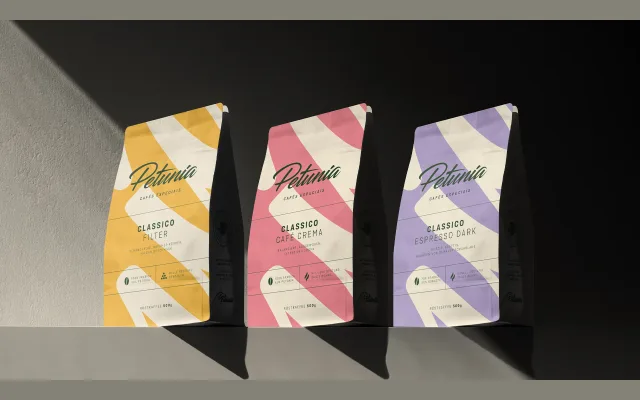
A refined wordmark and design system developed for Petúnia, a Brazilian specialty coffee brand from Minas Gerais, with curvilinear letterforms and a soft colour palette.
About
The project involved correcting and simplifying the original Petúnia wordmark, with curvilinear details intended to broaden the brand's market perception. A new information system was introduced across packaging to help consumers distinguish between product types. The updated petunia flower illustration was separated from the wordmark to function independently as a seal of authenticity.
Classification
The page describes a brand identity and packaging design project for a coffee brand, not a retail typeface. The design work centres on a refined wordmark with curvilinear details, categorised here as a display logotype by nature of its application.