Mooz
Papanapa · Cassia Freire, Gustavo Garcia, Lucas Rodrigues · 2023
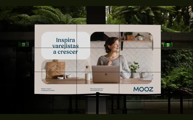
A rounded geometric wordmark and identity typeface designed for Mooz, the retail-tech financial brand of Grupo Boticário, replacing a rigid logo with softer, more fluid letterforms.
About
Created as part of a full brand evolution in 2023, the typography reflects the brand's repositioning away from sharp, thin-lined rigidity towards warmth and approachability. The rounded forms echo the broader modular visual system, called Gomooz, built from soft geometric shapes that communicate collaboration. Papanapa developed the work in partnership with Criatexto, who handled verbal identity and positioning.
Classification
The Mooz identity uses rounded, modular letterforms described as fluid and uncomplicated, placing it within a geometric display category. The soft, restless forms and rounded shapes are characteristic of contemporary brand-focused geometric display type.