Lilla & Charles
Papanapa · Gustavo Garcia, Isabella Mello, Thiago Bellotti
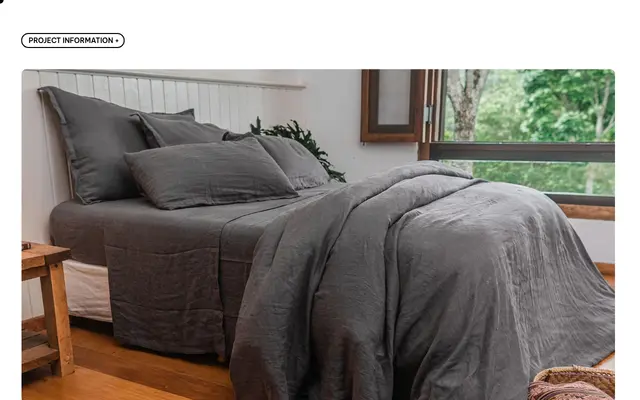
A visual identity built around a custom ampersand and light serif typography for an American sustainable linen brand with French and Indian production roots.
About
The identity centres on a bespoke ampersand drawn to evoke morning light filtering through linen, supported by earthy tones and a calm light serif. The typographic choice reinforces the brand's core narrative of slowing down to appreciate quality and detail. Papanapa positioned the brand around the archetype of the Magician, framing the production chain as a transformative, craft-led experience.
Classification
Described explicitly as 'light serif typography' with a calm, delicate personality suited to a slow-living lifestyle brand. The page does not name a specific typeface, but the described aesthetic points to a refined, low-contrast serif used in an editorial, branding context.