Geopagos
Papanapa · Gustavo Garcia, Isabella Mello, Lucas Rodrigues, Thiago Bellotti · 2021
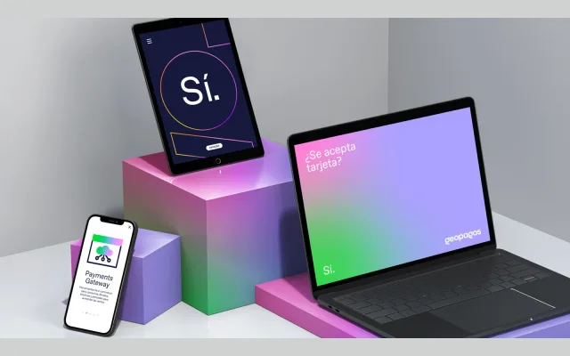
A brand identity system for Argentine fintech Geopagos, built around ABC Favorit and a logo combining rounded forms with sharp angles to express proximity and agility.
About
Designed by Papanapa in 2021, the Geopagos visual identity centres on a lowercase logo mark that pairs rounded shapes with sharp angles, conveying both friendliness and technological precision. The typographic family ABC Favorit by Dinamo anchors the system, supported by an extensive colour palette and geometric shapes derived from the logo. The letter G functions as a standalone brand symbol in abbreviated contexts.
Classification
The brand identity uses ABC Favorit by Dinamo, a geometric sans-serif, combined with rounded shapes and sharp angles in the logo mark. The typographic system is described as balancing human and technological characteristics.