Casa Galle
Papanapa · Gustavo Garcia, Cassia Freire, Luana Cordeiro, Lucas Rodrigues
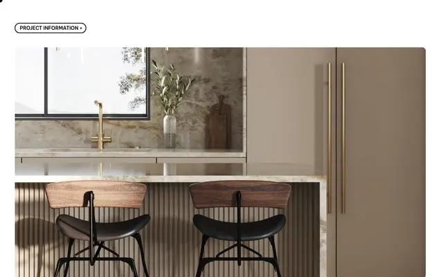
A delicate identity typeface developed for a premium tile and finishing store, built around vertical rhythm and a sense of lightness.
About
Designed as part of a comprehensive visual identity for Casa Galle, the typeface follows the rhythm of vertical lines that structure the brand's logo and pattern system. The letterforms aim for clarity and an airy presence suited to a brand positioned between art gallery and domestic warmth. The result is a refined typographic voice that supports flexible grid-based compositions across all brand touchpoints.
Classification
The page describes a delicate logo with vertical lines and lightness as core visual traits, suggesting a refined serif identity typeface, though specific typographic classification details are not explicitly stated on the page.