B.Naturais
sans-serifgeometric sans
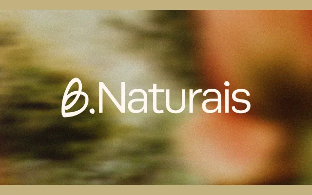
A custom light sans-serif identity typeface developed for a Brazilian cosmetics brand built around an essentialist, low-pressure aesthetic.
About
Designed as part of a full visual identity for B.Naturais, the typeface pairs simple, clean lines with a light weight to support the brand's unpretentious positioning. It sits alongside organic illustrations and a warm colour palette drawn from natural ingredients such as lavender and charcoal. The result is a restrained typographic voice that avoids excess in keeping with the brand's ethos.
Classification
The page describes a clean, sans-serif typeface with simple lines and a light weight, consistent with a geometric or humanist sans used in brand identity work.
Weights
Light
Languages
Latin
Tags
brandingcosmeticslightcleanminimalorganicidentity