Arpo
Papanapa · Gustavo Garcia, Gustavo Kone, Gabriela Almeida
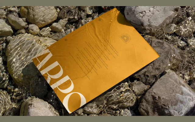
A bespoke all-caps logotype typeface designed for Brazilian dry gin brand Arpo, drawing on 1960s lettering traditions with a warm, solar character.
About
Designed by Papanapa for the Arpo gin brand, the letterforms carry the elegance of mid-century type with a distinctly Brazilian sensibility. The rounded O is used as an emblem, extended with radiating rays to evoke the brand's solar identity. The design supports a nostalgic, warmth-driven visual system rooted in Rio de Janeiro's coastal culture.
Classification
An all-caps logotype drawn with characteristics of 1960s lettering and a Brazilian vernacular flavour, with elegant proportions and a rounded O form. Classified as display due to its bespoke, single-weight logotype nature intended for branding use.