Glaser Kitchen
P22 Type Foundry · Milton Glaser
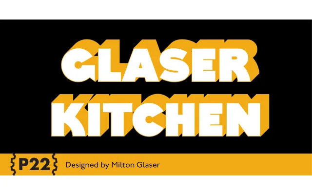
A digitisation of Milton Glaser's mid-1970s kitchen typeface, offered in four layerable styles to recreate the bold three-dimensional shadow effect of his original World Trade Center commission.
About
Originally created for The Big Kitchen in the World Trade Center's New York concourse, the design exemplifies the Art Deco revival aesthetic central to Glaser's graphic work of the period. P22's version offers a colour font alongside separate 3D Fill and 3D Shadow styles that can be layered to achieve tight, overlapping shadows, with a spaced-out Regular for simpler use. Based on original drawings and phototype proofs from the Milton Glaser Studios archives, it carries the formal approval of the Milton Glaser Estate.
Classification
A bold, three-dimensional Art Deco revival display typeface with layered shadow styles. Its geometric uppercase forms, strong weight and decorative 3D treatment place it firmly in the display category, with no italic or condensed cuts.