Brylski
P22 Type Foundry · Nick Sherman
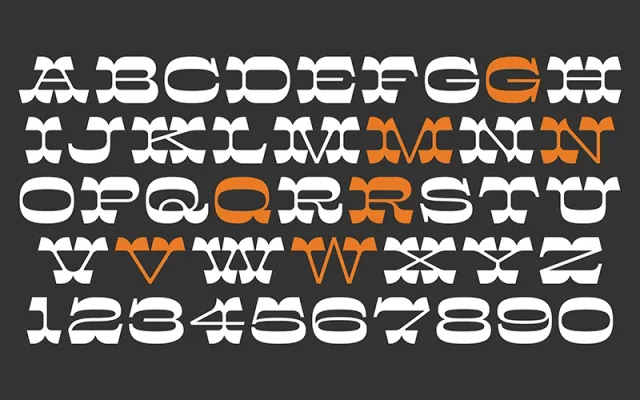
A single-weight display slab by Nick Sherman, reviving 19th-century wood type motifs with bifurcated serifs, extended proportions and dramatic thick-thin contrast.
About
Named for Hamilton Wood Type Museum volunteer Norb Brylski, the typeface blends characteristic features of the Victorian display era: heavy slab serifs with mansard-shaped sides, bifurcated terminals and extreme contrast between thick strokes and very thin middles. Stylistic alternates and eight stylistic sets offer period-appropriate variations alongside more contemporary letterform options. Latin coverage spans over 25 languages.
Classification
A display slab serif drawing on 19th-century wood type traditions, characterised by bifurcated serifs, extended proportions and extreme thick-thin contrast with mansard-shaped sides. The heavy bracketed tops and bottoms against very thin middles place it firmly in the decorative slab category.