 MegaMegaTypeType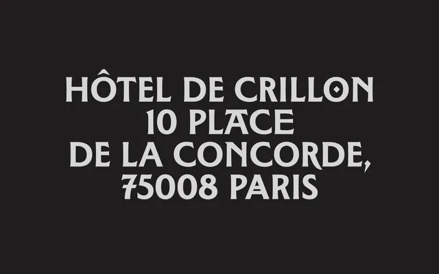
A display typeface rooted in the engraved inscriptions on the Morny family tomb at Père-Lachaise, where Roman incised letterforms meet the organic, floral modulations of nascent Art Nouveau.
About
Designed by Tim Vanhille and Inès Davodeau and released in 2026, the typeface takes the Viollet-le-Duc-designed monument as its primary source, identifying a formal tension between classical structural rigour and decorative impulse. Ornament is treated not as applied decoration but as something that emerges from within the construction of each letterform. The family spans eight weights from Thin to Black, with wide Latin language coverage, suited to editorial and cultural contexts requiring strong expressive presence.
Classification
A display typeface drawing on Roman incised letterforms observed on a Viollet-le-Duc-designed tomb, inflected with organic, floral modulations that bridge classical structure and Art Nouveau ornament. The category is display due to its strong expressive character and explicit conception for headline use only.