Wolpe Tempest
Omega Type Foundry · Berthold Wolpe (original), Toshi Omagari (revival) · 2017
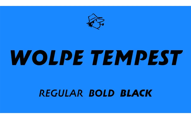
A 2017 revival of Berthold Wolpe's 1936 all-capitals slanted display sans, expanded from the original single dark weight to three weights with Greek, Cyrillic and extended swash alternates.
About
Originally created by Berthold Wolpe at Monotype in 1936, Tempest shares its skeleton with Albertus, most visibly in letters such as B, J and M, and is distinguished by fin-like stroke terminals reminiscent of Wolpe's lettering work for the British comic Eagle. Toshi Omagari's revival introduces two lighter weights alongside the original heavy cut, broadening its range without diluting its speedy, airy character. The swash letter set from the original has been substantially extended, and the family now covers Latin, Greek and Cyrillic scripts with a generous set of OpenType alternates.
Classification
An all-capitals slanted sans-serif designed for display use, featuring fin-like stroke terminals and an Albertus-like skeleton. Its decorative terminals and strong oblique stance place it firmly in the display category.