Wolpe Pegasus
Omega Type Foundry · Berthold Wolpe (original), Toshi Omagari (revival) · 2017
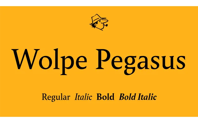
A careful revival of Berthold Wolpe's rarely seen 1937 serif, rescuing a long-circulated typographic secret from the Monotype Archive with corrected spacing, added small caps and a rebuilt italic.
About
Originally sketched by Wolpe at 16 pt in pencil and never widely released, Pegasus spent decades passed quietly among typographers as a lost gem. Toshi Omagari's 2017 revival works from the original drawings held at the Monotype Archive and The Type Archive, guided by Matthew Carter, who added the Bold and Italic in 1980 under Wolpe's supervision. Spacing, diacritics and punctuation are updated to modern standards, and the mechanically slanted italic of the original has been corrected to address the distortion inherent in that approach.
Classification
A humanist serif with deliberately inconsistent terminal and bowl details drawn from Wolpe's original 1937 pencil sketches, sharing characteristics with Albertus but intended for text use. Its irregularities are intentional, preserved and corrected in the revival.