Platia
Omega Type Foundry · Toshi Omagari · 2021
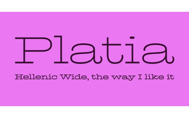
A scholarly revival of the 19th-century Hellenic Wide slab tradition, resolving the category's historical inconsistencies between upper and lowercase with contextual alternates and near-monolinear contrast.
About
Drawing from Antique Expanded and its Victorian-era relatives, Platia harmonises the mismatched upper and lowercase of the original sources into a cohesive monolinear slab with extended proportions. Contextual alternates with shortened serifs reduce the excessive letter-spacing inherent to wide, long-serifed capitals, allowing more text to fit without sacrificing the genre's character. The typeface extends to Cyrillic with Bulgarian alternates and Greek, reflecting its etymological connection to the Hellenic Wide tradition it interprets.
Classification
Wide, low-contrast slab serif in the Hellenic Wide tradition, derived from 19th-century Antique Extended typefaces. The near-monolinear stroke contrast and extended proportions place it firmly in the Victorian display slab category.