Metro Nova
Omega Type Foundry · Toshi Omagari · 2013
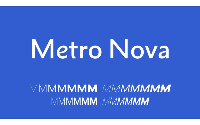
A thoughtful revival of William Addison Dwiggins's 1929 Metro, restoring the original humanist 'No. 1' design as the default and correcting the proportional compromises introduced by Linotype's duplexing system.
About
Dwiggins's Metro was compromised from the start by duplex spacing, which forced lighter weights to run wide and heavier weights to run condensed. Metro Nova corrects this by graduating width in proportion to weight, as well as reinstating the humanist No. 1 letterforms — double-storey a and g, cursive e — that had been superseded by the geometric No. 2 set. The geometric alternates remain accessible via OpenType stylistic sets, allowing per-glyph switching between the two historic design philosophies.
Classification
A revival of Dwiggins's Metro, Metro Nova defaults to the original humanist 'No. 1' design with double-storey a and g and cursive e, distinguishing it from the geometric No. 2 variant that became standard. Its calligraphic origins place it firmly in the humanist sans tradition despite the availability of geometric alternates via OpenType stylistic sets.