Équivoque
Omega Type Foundry · 2021
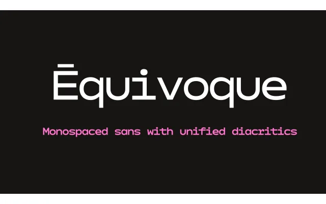
A monospaced display sans serif built around a single unified diacritic shape applied across the entire Latin character set, turning typographic convention into a deliberate conceptual provocation.
About
Rather than following the established norms for diacritic design, Équivoque replaces every accent mark with a single standardised shape, compressing the character set and introducing an intended ambiguity between accented characters. The dense, monospaced texture was chosen to match what the designer calls the 'brutality' of the effect. Conceived as an open question about legibility and convention, it works best in short display settings where the reader's contextual knowledge can fill the gaps.
Classification
A monospaced, display-weight sans serif with a dense, geometric texture. The monospaced structure and blunt letterforms give it a distinctly mechanical character, placing it firmly in the display grotesque/geometric tradition.