Albertus Nova
Omega Type Foundry · Toshi Omagari (revival of Berthold Wolpe's original) · 2017
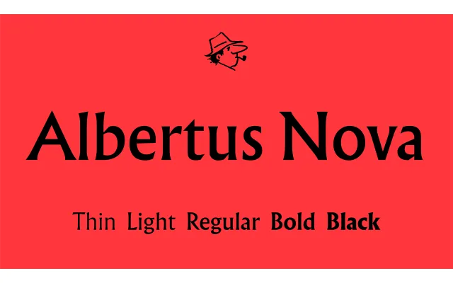
A scholarly revival of Berthold Wolpe's 1935 Albertus, researched through the Monotype Archive and redrawn with corrected weight balance, restored alternates, new small caps, additional weights and extended Greek and Cyrillic coverage.
About
Wolpe's original Albertus was a piecemeal design — uppercase and lowercase developed separately, leaving a weight and spacing discrepancy that persisted across decades of use. This revival corrects those inconsistencies, revises letterform proportions and restores historical alternates, while new Greek and Cyrillic scripts extend the family's reach. The research drew on archive material and conversations with Paul Wolpe, revealing the original Rotunda-influenced intentions behind the design's peculiar mix of roman capitals and blackletter-inflected lowercase.
Classification
Flare serif (also called glyphic or incised serif) revival of Berthold Wolpe's 1935 Albertus, characterised by low stroke contrast and chisel-cut flared terminals derived from inscription lettering rather than pen-drawn forms.