Nemorosa
sans-serifgeometric sansitalic
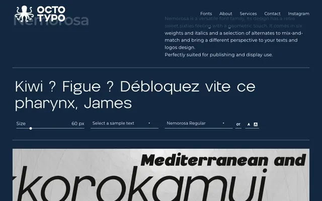
A six-weight geometric sans with a 1960s retro character, offering italic companions and alternate glyphs for varied typographic expression.
About
Nemorosa draws on the geometric sensibility of mid-twentieth-century sans-serif design, with a distinctly sixties flavour running through its forms. Six weights and matching italics give it range across both editorial and display contexts, while a set of alternates allows for further visual variation. The family is positioned for both publishing and logo work.
Classification
Geometric construction with a retro 1960s character, placing it firmly in the geometric sans-serif tradition. The period-influenced forms and alternate glyphs suggest rounded, optically balanced geometry typical of that era.
Weights
ThinLightRegularMediumBoldBlack
Languages
Latin
Tags
geometricretrosixtiesvintagedisplaypublishingalternatesmulti-weight