Mizzen
sans-serifhumanist sans
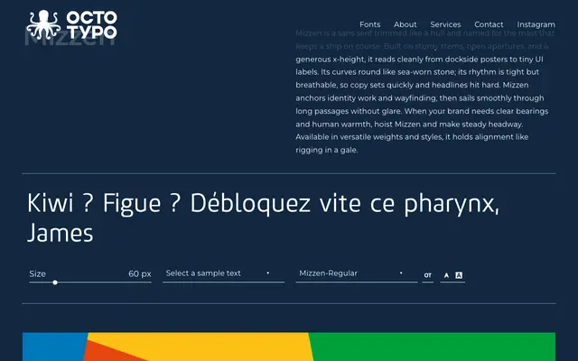
A humanist sans with open apertures and a generous x-height, designed to serve equally well in UI labels, wayfinding and long-form copy.
About
Built on sturdy stems and rounded curves, Mizzen aims for legibility at small sizes without sacrificing character at display scales. Open apertures keep text clear under adverse conditions, making it a practical choice for signage and identity work. The page shows only a Regular style, though the foundry references multiple weights and styles.
Classification
A sans-serif with open apertures, generous x-height and humanist warmth, placing it squarely in the humanist sans tradition. The description of sea-worn curves and tight yet breathable rhythm is consistent with a humanist rather than geometric or grotesque approach.
Weights
Regular
Languages
Latin
Tags
humanistsans-serifuiwayfindingidentitybrandingfunctional