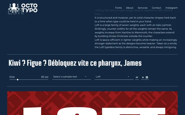
A seven-weight serif family with matching italics, built on a modular structure where stroke weight grows outward from a consistent counter width across all styles.
About
The family spans from Hairline to Mammoth, with each step in weight achieved by adding stroke mass outside the counter rather than reducing internal space. This approach keeps lighter weights space-efficient while producing increasingly commanding forms at heavier settings. The design draws on 19th century type conventions, giving the letterforms a tactile, physical quality at odds with much contemporary digital type.
Classification
Described as inspired by 19th century fonts with solid character shapes and a modular, structured construction. The consistent counter widths across weights and stroke-based weight expansion suggest a display-oriented serif with historical roots.