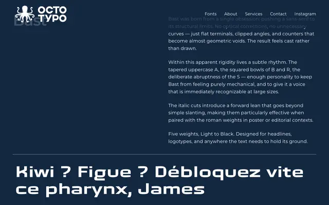
A stark geometric sans built around flat terminals, clipped angles and near-void counters, designed for headlines and logotypes where structural tension does the work.
About
Bast resists optical correction in favour of deliberate abruptness: flat terminals, squared bowls and a clipped geometry that makes the letterforms feel pressed from metal rather than drawn. Enough character survives the rigidity — the tapered A, the idiosyncratic S — to give it a recognisable voice at large sizes. Italic cuts add a genuine forward lean rather than a simple slant, making roman and italic pairings effective in poster and editorial contexts.
Classification
Bast is a geometric sans-serif characterised by flat terminals, clipped angles and near-geometric counters, placing it firmly in the geometric sans tradition despite its deliberately austere, cast-metal aesthetic.