Antipod
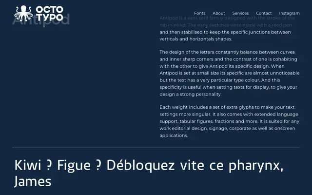
A humanist sans-serif drawn from reed pen sketches, with nib-influenced junctions that create a distinctive type colour at text sizes and strong personality at display.
About
Antipod balances curves against inner sharp corners, a tension that originates in early reed pen sketches and was then refined to stabilise the junctions between verticals and horizontals. At small sizes the calligraphic origins recede, leaving a particular type colour; at display sizes the letterforms assert a clear character. Each weight includes supplementary glyphs, tabular figures, fractions and extended language support.
Classification
Rooted in calligraphic nib-drawn strokes, Antipod exhibits the characteristics of a humanist sans: modulated stroke contrast, organic junctions between verticals and horizontals, and a balance between curves and sharp inner corners derived from reed pen sketching.