 MegaMegaTypeType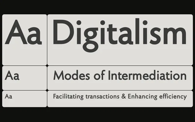
A humanist sans with classical roman proportions and open spacing, positioned in the tradition of Gill Sans and Syntax rather than geometric or Swiss grotesque models.
About
Kelly Sans calibrates its letterforms and widths toward classical roman ideals, with spacing held more open than is typical of sans serifs to prevent crowding at smaller sizes. The Book weight matches the colour of a conventional roman font, while Semibold reads as noticeably heavier without distorting the letterforms. Italics are sloped romans throughout, with only the two-storey a and g departing from that rule, prioritising clarity and classical consistency.
Classification
A humanist sans serif in the tradition of Gill Sans and Syntax, using classical roman proportions and open spacing rather than geometric or Swiss-grotesque conventions. Italics are sloped romans throughout, reinforcing its classical humanist alignment.