 MegaMegaTypeType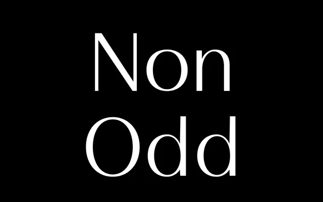
A serif with abrupt, cropped terminals and high internal contrast, deliberately breaking from soft traditional serif conventions.
About
Non Odd sets a rigid vertical structure against organic, high-contrast details, using cropped rather than bracketed terminals for a precise, slightly unsettled character. Three weights cover editorial and identity work without an italic. The foundry pitches it as sitting somewhere between sans and serif, built to avoid looking like anything else on the shelf.
Classification
Abrupt, cropped terminals combined with high internal contrast push this away from a traditional soft-bracketed serif into something closer to an unconventional sans-serif hybrid, though the foundry classifies it as a serif.
Weights
LightRegularBold
Languages
Latin Extended
Tags
serifeditorialidentitycontrastunconventional