 MegaMegaTypeType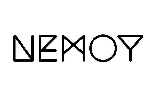
A geometric display family in five weights, originally designed for Philip K. Dick book covers and available as a free variable font with broad multilingual support.
About
Designed by Bastien Sozeau in 2010 and updated to version 4 in 2024, Nemoy is built around clean geometric forms suited to large-scale titling work. Its 1040-glyph set covers 360 languages and includes old-style figures, circled characters, fractions and case-sensitive forms. A variable font version is available alongside the five static weights, and the source is open on GitHub.
Classification
Geometric construction with even stroke weights and a clean, modular structure typical of geometric sans-serif display faces. Positioned as a display family through its stark letterforms and origin as a book-cover titling face.