 MegaMegaTypeType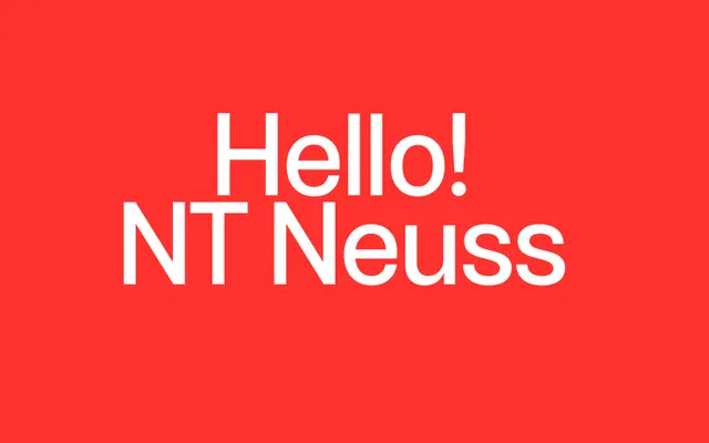
A deliberately generic-looking grotesque built as a rebellion against the type world's suspicion of the ordinary.
About
NT Neuss leans into the anonymous look of default system fonts on purpose, arguing that 'generic' needn't mean uninteresting. Slightly condensed proportions give it good performance in running text. Five weights with italics suit complex visual systems and editorial projects.
Classification
A slightly condensed, deliberately anonymous grotesque modelled on generic system fonts places this as a functional grotesque.
Weights
LightLight ItalicRegularRegular ItalicMediumMedium ItalicBoldBold ItalicBlackBlack Italic
Languages
Latin
Tags
grotesquegenericeditorialsystemfunctional