Mangerica
Ndiscover · Natanael Gama
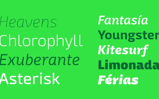
A nine-weight humanist sans-serif by Natanael Gama that mixes geometric structure with script-inflected details, growing increasingly characterful and contrast-rich at the extremes.
About
Mangerica blends geometric construction, script influences and humanist letter shapes into a cohesive family spanning nine weights with matching italics. The intermediate weights, with their large counters, low contrast and generous x-height, are suited to text setting at small sizes, while the heaviest cuts introduce deliberate contrast irregularities that give them a bold, cartoonish presence at display sizes. The family ships with an extensive OpenType feature set including small caps, ligatures, stylistic alternates, old-style figures and more.
Classification
A humanist sans-serif that blends geometric construction with script-influenced details and organic, personality-driven letterforms. The heavier weights introduce intentional contrast irregularities that push the design toward display territory.