Mangerica
Natanael Gama · Natanael Gama
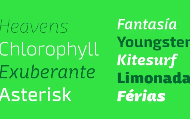
A Latin sans-serif mixing humanist, geometric and script shapes into a nine-weight family that shifts character from workhorse text at mid-weights to expressive display at the extremes.
About
Large counters, low contrast and a generous x-height give the intermediate weights solid legibility at small sizes, while deliberate contrast irregularities at the heavier ends produce a distinctive, slightly cartoonish quality. The design draws on script, geometric and humanist influences simultaneously without feeling eclectic. A thorough OpenType feature set includes small caps, discretionary ligatures, old-style figures, stylistic alternates and multiple numeral styles.
Classification
A sans-serif that blends geometric, humanist and script influences into a single coherent system. The mix of large counters, low contrast and script-derived details places it firmly in the humanist sans tradition, with display-oriented personality at extreme weights.