Restora Neue
Nasir Udin Studio · Nasir Udin · 2020
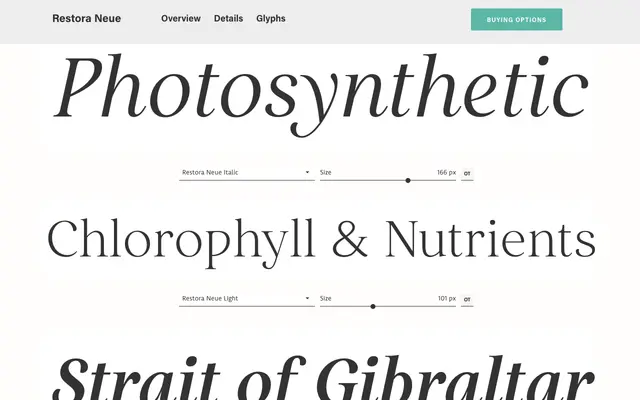
A refined evolution of Restora with higher contrast and sharper serifs, available in nine weights with matching italics across 200+ Latin-based languages.
About
Restora Neue takes the imperfect character of its predecessor and redraws it with neater forms and increased stroke contrast. Sharp, elongated serifs carry a faint medieval quality that sits comfortably across both classical and contemporary design contexts. The family includes extensive OpenType features — small caps, stylistic alternates, old-style figures and three stylistic sets — making it a practical choice for editorial, branding and book cover work.
Classification
An old-style roman serif with high contrast and sharp, elongated serifs with a slight medieval influence. The combination of classical serif structure and refined letterforms places it firmly in the old-style tradition.