Luks Deco
Nasir Udin Studio · Haidi Shabrina, Nasir Udin · 2024
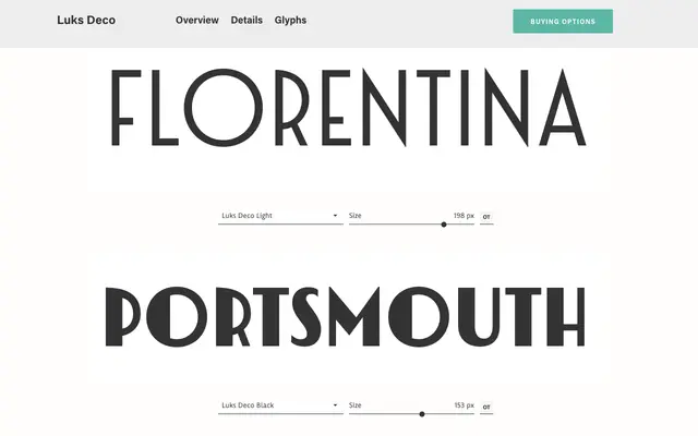
A geometric display typeface rooted in the Art Deco conventions of the 1920s, offering a weight range from Light to Black with distinct circular letterforms that shift subtly in construction across the family.
About
Luks Deco draws from the strong geometric vocabulary of 1920s Art Deco, with circular letters such as O, C, G and Q adopting slightly different constructions at different weights to maintain visual coherence without sacrificing character. The family spans four weights and supports Latin script across Western and Central/Eastern European languages, Baltic, Turkish and Romanian. With 524 glyphs and OpenType features including stylistic alternates and fractions, it is suited to headline and branding work where a period-inflected flavour is required.
Classification
A geometric display typeface drawing directly from Art Deco conventions of the 1920s, with strong circular forms and high contrast between geometric shapes. The varying letterform construction across weights, particularly in circular glyphs, reinforces its display-oriented character.