Fernoa
Nasir Udin Studio · Nasir Udin · 2026
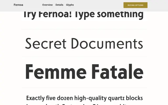
A high-contrast geometric sans-serif rooted in Art Deco architecture and noir cinema aesthetics, built for display use with sharp terminal cuts and strong weight contrast.
About
Fernoa draws its character from mid-century Art Deco geometry and the visual tension of classic film noir, combining razor-sharp terminals with pronounced stroke contrast across its weight range. The design targets cinematic, editorial and branding contexts where dramatic presence is the priority. With 705 glyphs and full Cyrillic support, it covers Western European, Central and Eastern European, Baltic, Turkish, Romanian and Cyrillic scripts.
Classification
A geometric sans-serif with high stroke contrast and sharp terminal cuts, drawing on Art Deco structural geometry and noir-era display typography rather than neutral grotesque conventions.