 MegaMegaTypeType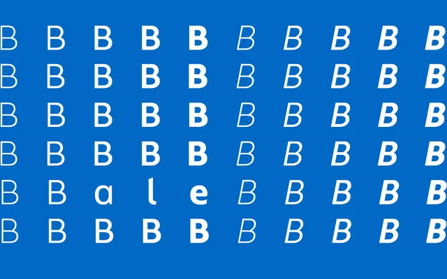
A generously proportioned sans with angled terminals, warm enough for branding without losing structure.
About
Bale sits between clean and characterful: generous x-height and proportions with distinctive angled terminals give it a bit of personality without tipping into display territory. Five weights with italics handle branding and editorial work. A monospaced sibling, Bale Mono, extends the family into technical contexts.
Classification
Generous proportions and angled terminals give this a friendlier grotesque character rather than a neutral or geometric reading.
Weights
ThinLightRegularMediumBoldThin ItalicLight ItalicRegular ItalicMedium ItalicBold Italic
Family
Languages
Latin Extended
Tags
grotesquewarmbrandingeditorialversatile