Hammer and Hope
Morcos Key · Morcos Key
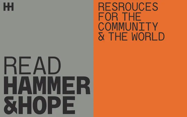
A custom all-caps monospaced display typeface designed for Hammer and Hope magazine, built around a half-spaced rhythm that gives the publication a distinctive, politically charged voice.
About
Created as part of a full brand identity for Hammer and Hope, a magazine rooted in the Black radical tradition, the typeface uses a monospaced alphabet with precisely measured half-spaced gaps to produce a consistent, resolute cadence across editorial and digital contexts. Its all-caps construction prioritises impact and uniformity, functioning as the visual anchor of the magazine's identity. The design balances assertiveness with an earnest, unaffected quality suited to the publication's editorial tone.
Classification
An all-caps monospaced display typeface with precisely crafted half-spaced gaps, designed to create a resolute visual rhythm. Its geometric, impactful character and monospaced construction place it firmly in the display category.