 MegaMegaTypeType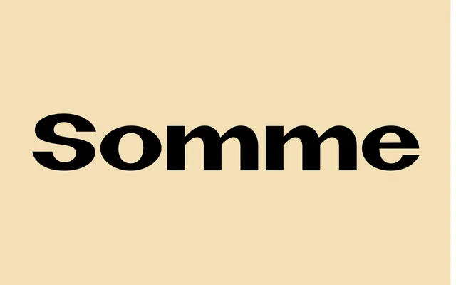
A wide, heavy headline face from a 1974 Soviet school poster, Latin drawn by a Cyrillic hand.
About
Somme's letters carry Cyrillic habits into Latin, so N, S and K look slightly foreign and the r ends in a ball. Wide forms, tight spacing and a tall x-height make it a strong headline face, and the Cyrillic extension means it works in both scripts. Try it on record sleeves, posters and science or retro-Soviet themes.
Classification
Based on hand lettering by K. V. Voskresensky on a 1974 Volgograd science poster, where a Cyrillic-trained hand drew Latin: thin centres in N and S, a heavy-stemmed U, a ball-terminal r and a seriffed l, all held together by near-diamond rounds. Wide, tightly spaced and tall in x-height, with an alternate single-storey g. Single Bold style; 410 glyphs including Cyrillic.