 MegaMegaTypeType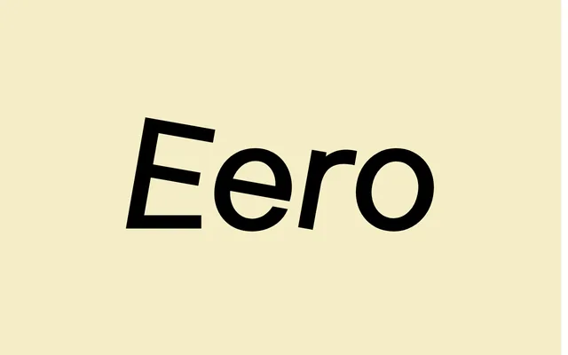
A neo-grotesque gone wrong on purpose, lifted from enamel street signs and their untrained draughtsmen.
About
Eero looks modern from a distance and odd up close: proportions wobble and curves crowd each other. Regular, Italic and Bold handle text and emphasis, while the Rotalic and the Outline capitals stack and layer for headlines. Good for identities and editorial work that want a vernacular edge.
Classification
A deliberately clumsy neo-grotesque drawn from enamel street signs, with odd proportions and crowded curves. The family pairs Regular, Italic and Bold with an experimental Rotalic and outlined capitals for layering. Limited character set: 217 glyphs, with a narrow range of accented Latin.
Weights
RegularBold
Family
Eero RegularEero ItalicEero BoldEero RotalicEero Outline
Languages
Latin (limited, 217 glyphs)
Tags
neo-grotesquestreet-signsquirkyvernacularoutlinelayeringeditorialnordic